
Tutorial Stats
How To Make A One Page Smooth Scrolling Navigation (Without Anchor Links) In Your Weebly Site

Tutorial Description
In July of 2015, we showed you how to create a one page smooth scrolling navigation in your Weebly site, but with anchor links.
Anchor links will do this job, but we're all about efficiency and simplicity, so we're going to show you how to create a one page smooth scrolling navigation in your Weebly site without any anchor links!
An alternative method.
As quick refresher (if you need it), a one page smooth scrolling navigation is a website that has only one page -- the homepage. With this type of website, all of the content found on the website is normally found on the homepage.
To complement this type of website, the parent menu items in the navigation smoothly scroll to corresponding sections below when they're clicked. When the "Home" parent menu item is clicked, the page scrolls to the top.
Simple concept, but a bit involved to implement. If you need help implementing this modification, you can hire E. T. Services.
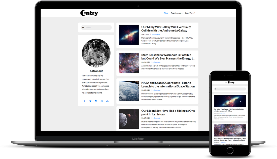
Note: We're using Weebly's free theme "Cento" for this tutorial.
Anchor links will do this job, but we're all about efficiency and simplicity, so we're going to show you how to create a one page smooth scrolling navigation in your Weebly site without any anchor links!
An alternative method.
As quick refresher (if you need it), a one page smooth scrolling navigation is a website that has only one page -- the homepage. With this type of website, all of the content found on the website is normally found on the homepage.
To complement this type of website, the parent menu items in the navigation smoothly scroll to corresponding sections below when they're clicked. When the "Home" parent menu item is clicked, the page scrolls to the top.
Simple concept, but a bit involved to implement. If you need help implementing this modification, you can hire E. T. Services.
Note: We're using Weebly's free theme "Cento" for this tutorial.
SHOW MORE
Tutorial
Step 1. Create Your Homepage
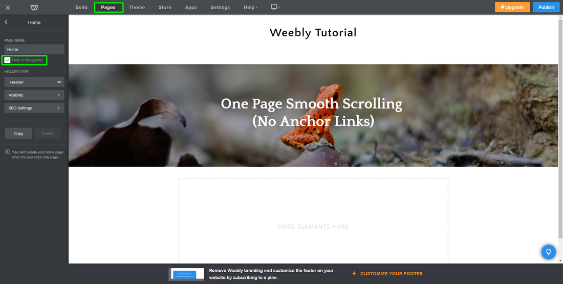
Go to "Pages" at the top, click the "+" icon on the left, and select "Standard Page".
Name the "PAGE NAME" anything you want. Check off the "Hide in Navigation" box.
Name the "PAGE NAME" anything you want. Check off the "Hide in Navigation" box.
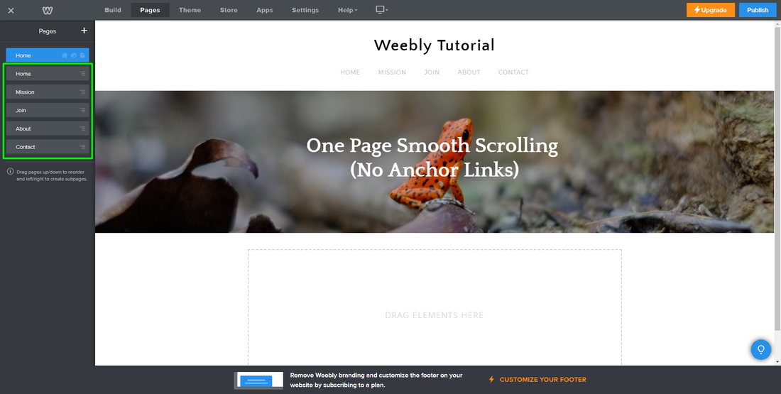
Step 2. create your navigation
While still under "Pages" at the top, click on the "+" icon and select "Non-clickable Menu". Use this option to create your navigation.
For our demo site, we created 5 non-clickable menu items (home, mission, join, about, and contact).
For our demo site, we created 5 non-clickable menu items (home, mission, join, about, and contact).
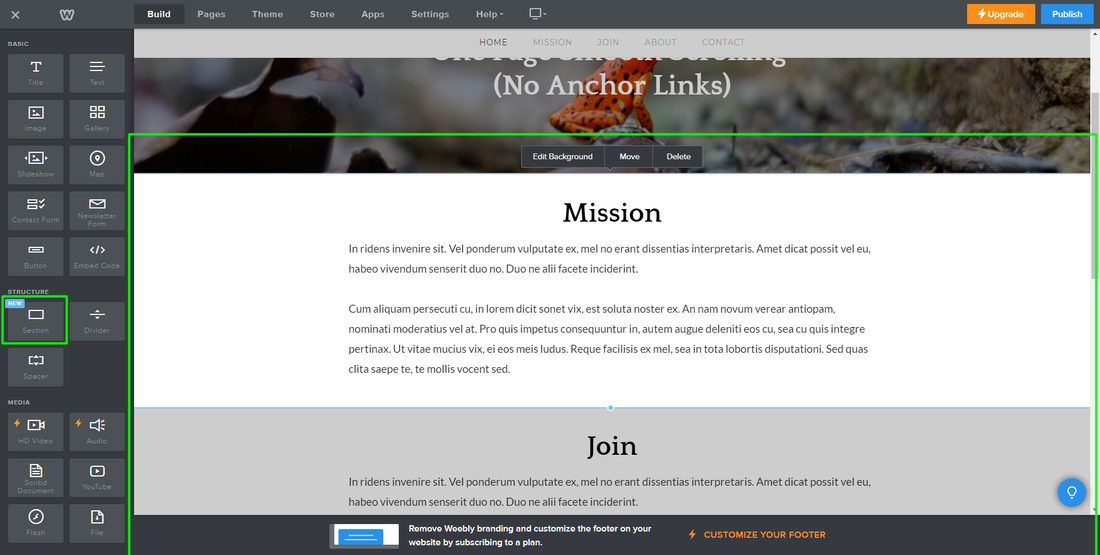
Step 3. Create Your sections
Go to "Build" at the top, and on the left, grab the "Section" element and add it to the site.
For our demo site, we're going to create 4 sections. Each section will correspond with a non-clickable menu in the navigation (mission, join, about, and contact).
Note: You can add as many "Section" elements as you want, as not all of them have to correspond to a non-clickable menu in the navigation.
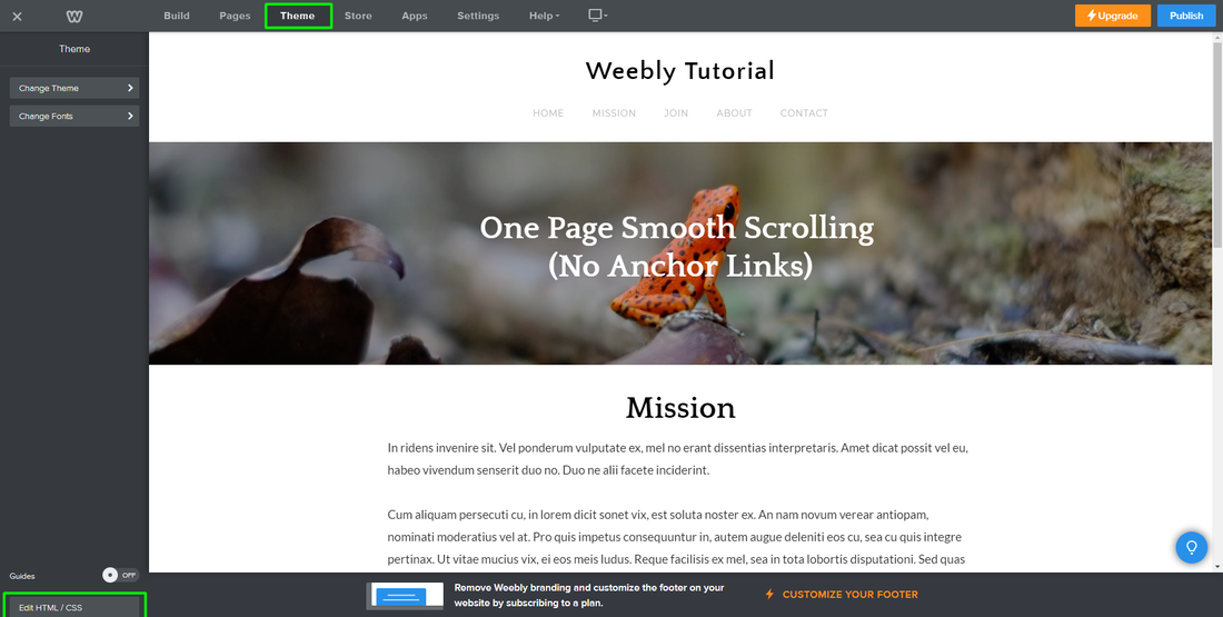
Step 4. Open Weebly's HTML/CSS Editor
At the top, click on 'Theme', and on the bottom-left, click on 'Edit HTML/CSS'.
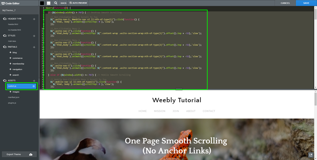
Step 5. Add jQuery Codes
On the left under "ASSETS", click on the "custom.js" file. On the right, add the below jQuery code directly beneath "jQuery(function($) {":
if ($(window).width() > 767) { // Desktop Smooth Scrolling
// Non-Clickable Menu 1 Scroll To Top
$(".wsite-nav-1, #mobile-nav ul li:nth-of-type(1)").click(function() {
$('html, body').animate({scrollTop: 0 },'slow');
});
// Non-Clickable Menu 2
$(".wsite-nav-2").click(function() {
$('html,body').animate({scrollTop: $(".content-wrap .wsite-section-wrap:nth-of-type(1)").offset().top + -51},'slow');
});
// Non-Clickable Menu 3
$(".wsite-nav-3").click(function() {
$('html,body').animate({scrollTop: $(".content-wrap .wsite-section-wrap:nth-of-type(2)").offset().top + -51},'slow');
});
// Non-Clickable Menu 4
$(".wsite-nav-4").click(function() {
$('html,body').animate({scrollTop: $(".content-wrap .wsite-section-wrap:nth-of-type(3)").offset().top + -51},'slow');
});
// Non-Clickable Menu 5
$(".wsite-nav-5").click(function() {
$('html,body').animate({scrollTop: $(".content-wrap .wsite-section-wrap:nth-of-type(4)").offset().top + -51},'slow');
});
} else if ($(window).width() <= 767) { // Mobile Smooth Scrolling
// Mobile Non-Clickable Menu 1 Scroll To Top
$(".mobile-nav ul li:nth-of-type(1)").click(function() {
$('html, body').animate({scrollTop: 0 },'slow');
});
// Mobile Non-Clickable Menu 2
$(".mobile-nav ul li:nth-of-type(2)").click(function() {
$('html,body').animate({scrollTop: $(".content-wrap .wsite-section-wrap:nth-of-type(1)").offset().top + -50},'slow');
});
// Mobile Non-Clickable Menu 3
$(".mobile-nav ul li:nth-of-type(3)").click(function() {
$('html,body').animate({scrollTop: $(".content-wrap .wsite-section-wrap:nth-of-type(2)").offset().top + -50},'slow');
});
// Mobile Non-Clickable Menu 4
$(".mobile-nav ul li:nth-of-type(4)").click(function() {
$('html,body').animate({scrollTop: $(".content-wrap .wsite-section-wrap:nth-of-type(3)").offset().top + -50},'slow');
});
// Mobile Non-Clickable Menu 5
$(".mobile-nav ul li:nth-of-type(5)").click(function() {
$('html,body').animate({scrollTop: $(".content-wrap .wsite-section-wrap:nth-of-type(4)").offset().top + -50},'slow');
});
}
// Close Mobile Navigation When li Is Clicked
$(".mobile-nav ul li").on("click", function() {
$("body").removeClass("nav-open");
});
Click "SAVE".
Step 6. Adjust jQuery Code
In order to get the smooth scrolling to work with your specific theme, we need to obtain 6 pieces of information from your theme:
Below, we'll show you how to obtain each of the 6 pieces of information and how to adjust the jQuery code with them. The information we obtain will be in orange:
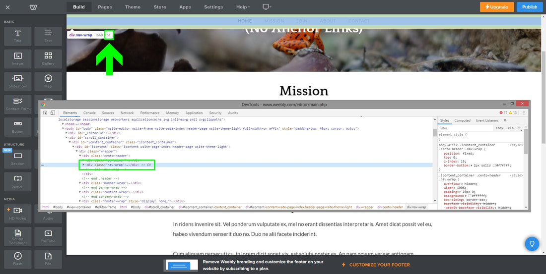
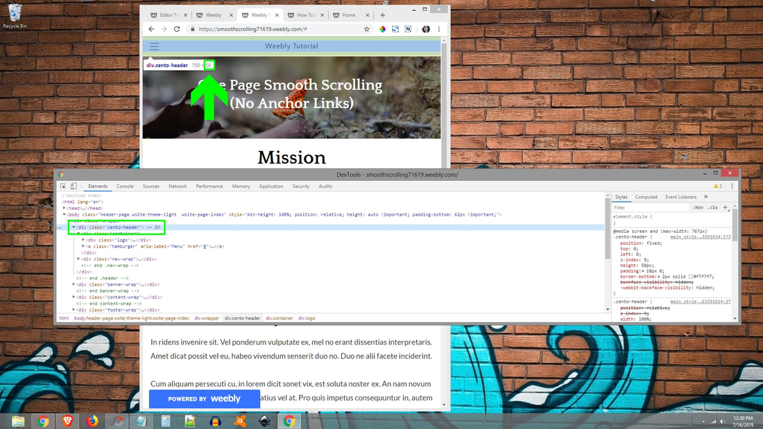
1. Desktop navigation height: 51
Right click on your theme's navigation and select "Inspect". When the DevTools window appears, locate your navigation's HTML code and identify its height. Now add it to the jQuery code as shown below in orange:
...
// Non-Clickable Menu 2
$(".wsite-nav-2").click(function() {
$('html,body').animate({scrollTop: $(".content-wrap .wsite-section-wrap:nth-of-type(1)").offset().top + -51},'slow');
});
// Non-Clickable Menu 3
$(".wsite-nav-3").click(function() {
$('html,body').animate({scrollTop: $(".content-wrap .wsite-section-wrap:nth-of-type(2)").offset().top + -51},'slow');
});
// Non-Clickable Menu 4
$(".wsite-nav-4").click(function() {
$('html,body').animate({scrollTop: $(".content-wrap .wsite-section-wrap:nth-of-type(3)").offset().top + -51},'slow');
});
// Non-Clickable Menu 5
$(".wsite-nav-5").click(function() {
$('html,body').animate({scrollTop: $(".content-wrap .wsite-section-wrap:nth-of-type(4)").offset().top + -51},'slow');
});
...
- Desktop navigation height
- Main content area's CSS "class" or "id"
- Mobile navigation activation width
- Mobile navigation height
- Mobile navigation's CSS "class" or "id"
- Mobile navigation's toggle class
Below, we'll show you how to obtain each of the 6 pieces of information and how to adjust the jQuery code with them. The information we obtain will be in orange:
1. Desktop navigation height: 51
Right click on your theme's navigation and select "Inspect". When the DevTools window appears, locate your navigation's HTML code and identify its height. Now add it to the jQuery code as shown below in orange:
...
// Non-Clickable Menu 2
$(".wsite-nav-2").click(function() {
$('html,body').animate({scrollTop: $(".content-wrap .wsite-section-wrap:nth-of-type(1)").offset().top + -51},'slow');
});
// Non-Clickable Menu 3
$(".wsite-nav-3").click(function() {
$('html,body').animate({scrollTop: $(".content-wrap .wsite-section-wrap:nth-of-type(2)").offset().top + -51},'slow');
});
// Non-Clickable Menu 4
$(".wsite-nav-4").click(function() {
$('html,body').animate({scrollTop: $(".content-wrap .wsite-section-wrap:nth-of-type(3)").offset().top + -51},'slow');
});
// Non-Clickable Menu 5
$(".wsite-nav-5").click(function() {
$('html,body').animate({scrollTop: $(".content-wrap .wsite-section-wrap:nth-of-type(4)").offset().top + -51},'slow');
});
...
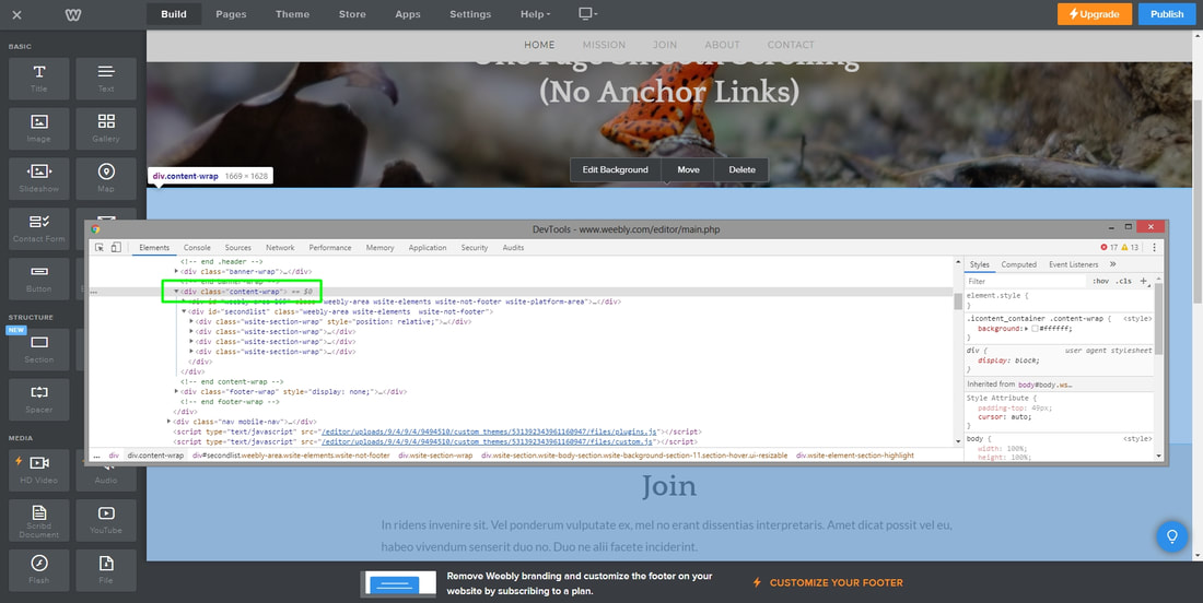
2. Main content area's CSS "class" or "id": .content-wrap
Right click on your theme's main content area and select "Inspect". Locate your main content area's HTML code and identify its "class" or "id". Adjust the jQuery code as shown below in orange:
// Non-Clickable Menu 2
$(".wsite-nav-2").click(function() {
$('html,body').animate({scrollTop: $(".content-wrap .wsite-section-wrap:nth-of-type(1)").offset().top + -51},'slow');
});
// Non-Clickable Menu 3
$(".wsite-nav-3").click(function() {
$('html,body').animate({scrollTop: $(".content-wrap .wsite-section-wrap:nth-of-type(2)").offset().top + -51},'slow');
});
// Non-Clickable Menu 4
$(".wsite-nav-4").click(function() {
$('html,body').animate({scrollTop: $(".content-wrap .wsite-section-wrap:nth-of-type(3)").offset().top + -51},'slow');
});
// Non-Clickable Menu 5
$(".wsite-nav-5").click(function() {
$('html,body').animate({scrollTop: $(".content-wrap .wsite-section-wrap:nth-of-type(4)").offset().top + -51},'slow');
});
} else if ($(window).width() <= 767) { // Mobile Smooth Scrolling
// Mobile Non-Clickable Menu 1 Scroll To Top
$(".mobile-nav ul li:nth-of-type(1)").click(function() {
$('html, body').animate({scrollTop: 0 },'slow');
});
// Mobile Non-Clickable Menu 2
$(".mobile-nav ul li:nth-of-type(2)").click(function() {
$('html,body').animate({scrollTop: $(".content-wrap .wsite-section-wrap:nth-of-type(1)").offset().top + -50},'slow');
});
// Mobile Non-Clickable Menu 3
$(".mobile-nav ul li:nth-of-type(3)").click(function() {
$('html,body').animate({scrollTop: $(".content-wrap .wsite-section-wrap:nth-of-type(2)").offset().top + -50},'slow');
});
// Mobile Non-Clickable Menu 4
$(".mobile-nav ul li:nth-of-type(4)").click(function() {
$('html,body').animate({scrollTop: $(".content-wrap .wsite-section-wrap:nth-of-type(3)").offset().top + -50},'slow');
});
// Mobile Non-Clickable Menu 5
$(".mobile-nav ul li:nth-of-type(5)").click(function() {
$('html,body').animate({scrollTop: $(".content-wrap .wsite-section-wrap:nth-of-type(4)").offset().top + -50},'slow');
});
}
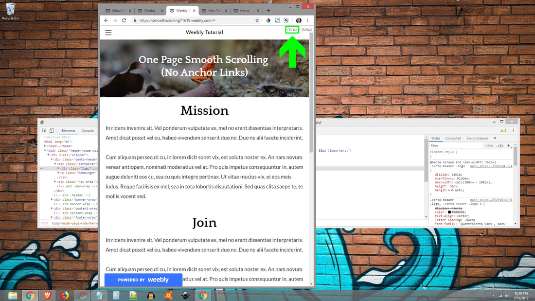
3. Mobile navigation activation width: 767 (the width a browser needs to be at to deactivate the desktop navigation and activate the mobile navigation).
With the DevTools window still open, reduce the width of your browser until the mobile navigation appears. Take note of the width in the top right corner at which the mobile navigation appears.
Now add it to the jQuery code as shown below in orange:
...
} else if ($(window).width() <= 767) { // Mobile Smooth Scrolling
...
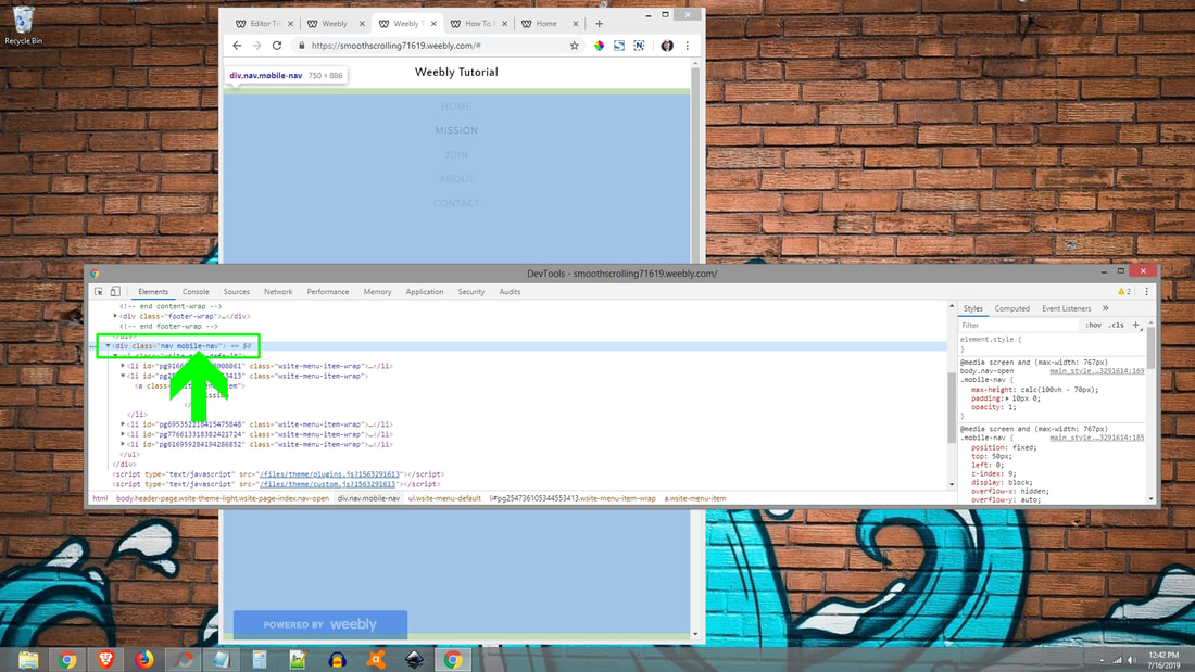
4. Mobile navigation height: 50
With your browser still at your mobile navigation activation width (767), right click on your mobile theme's header and select "Inspect". When the DevTools window appears, locate your header's HTML code and identify its height. Now add it to the jQuery code as shown below in orange:
...
// Mobile Non-Clickable Menu 2
$(".mobile-nav ul li:nth-of-type(2)").click(function() {
$('html,body').animate({scrollTop: $(".content-wrap .wsite-section-wrap:nth-of-type(1)").offset().top + -50},'slow');
});
// Mobile Non-Clickable Menu 3
$(".mobile-nav ul li:nth-of-type(3)").click(function() {
$('html,body').animate({scrollTop: $(".content-wrap .wsite-section-wrap:nth-of-type(2)").offset().top + -50},'slow');
});
// Mobile Non-Clickable Menu 4
$(".mobile-nav ul li:nth-of-type(4)").click(function() {
$('html,body').animate({scrollTop: $(".content-wrap .wsite-section-wrap:nth-of-type(3)").offset().top + -50},'slow');
});
// Mobile Non-Clickable Menu 5
$(".mobile-nav ul li:nth-of-type(5)").click(function() {
$('html,body').animate({scrollTop: $(".content-wrap .wsite-section-wrap:nth-of-type(4)").offset().top + -50},'slow');
});
...
5. Mobile navigation's CSS "class" or "id": .mobile-nav
With your browser still at your mobile navigation activation width (767), click on your mobile navigation's toggle icon. Now right click on the mobile navigation and when the DevTools window appears, locate your mobile navigation's HTML code and identify its "class" or "id".
Now add it to the jQuery code as shown below in orange:
...
// Mobile Non-Clickable Menu 1 Scroll To Top
$(".mobile-nav ul li:nth-of-type(1)").click(function() {
$('html, body').animate({scrollTop: 0 },'slow');
});
// Mobile Non-Clickable Menu 2
$(".mobile-nav ul li:nth-of-type(2)").click(function() {
$('html,body').animate({scrollTop: $(".content-wrap .wsite-section-wrap:nth-of-type(1)").offset().top + -50},'slow');
});
// Mobile Non-Clickable Menu 3
$(".mobile-nav ul li:nth-of-type(3)").click(function() {
$('html,body').animate({scrollTop: $(".content-wrap .wsite-section-wrap:nth-of-type(2)").offset().top + -50},'slow');
});
// Mobile Non-Clickable Menu 4
$(".mobile-nav ul li:nth-of-type(4)").click(function() {
$('html,body').animate({scrollTop: $(".content-wrap .wsite-section-wrap:nth-of-type(3)").offset().top + -50},'slow');
});
// Mobile Non-Clickable Menu 5
$(".mobile-nav ul li:nth-of-type(5)").click(function() {
$('html,body').animate({scrollTop: $(".content-wrap .wsite-section-wrap:nth-of-type(4)").offset().top + -50},'slow');
});
}
// Close Mobile Navigation When li Is Clicked
$(".mobile-nav ul li").on("click", function() {
$("body").removeClass("nav-open");
});
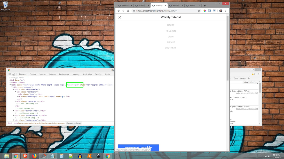
6. Mobile navigation's toggle class(es): .nav-open
With your browser still at your mobile navigation activation width (767) and the DevTools window still open, click on your mobile navigation's toggle icon. When you do this, take note of any class being added in the DevTools window.
For our theme, the class "nav-open" is being added to our "<body>" tag in order to show the mobile navigation.
In order to close the mobile navigation when a non-clickable menu is clicked, we need to remove the "nav-open" class. We do this by adjusting the jQuery code as shown below in orange:
..
// Close Mobile Navigation When li Is Clicked
$(".mobile-nav ul li").on("click", function() {
$("body").removeClass("nav-open");
});
You're Done! Publish your site to see your new one page smooth scrolling navigation!
Tips & Additional information: Linking Navigation To Section
Choose which section a non-clickable menu links to is very easy. Here is a piece of the jQuery code above:
// Non-Clickable Menu 2
$(".wsite-nav-2").click(function() {
$('html,body').animate({scrollTop: $(".content-wrap .wsite-section-wrap:nth-of-type(1)").offset().top + -51},'slow');
});
The "2" in ".wsite-nav-2" refers to the 2nd non-clickable menu. The "1" in ".wsite-section-wrap:nth-of-type(1) refers to the 1st section in the main content area.
In short, this means the 2nd item in the navigation will smoothly scroll to the 1st section in the main content area. You can adjust these numbers in the jQuery code to control how your smooth scroll navigation behaves.
Note: Be sure to reflect any changes made in the desktop portion of the jQuery code to the mobile portion of the jQuery code.
Tips & Additional information: Point On Hover
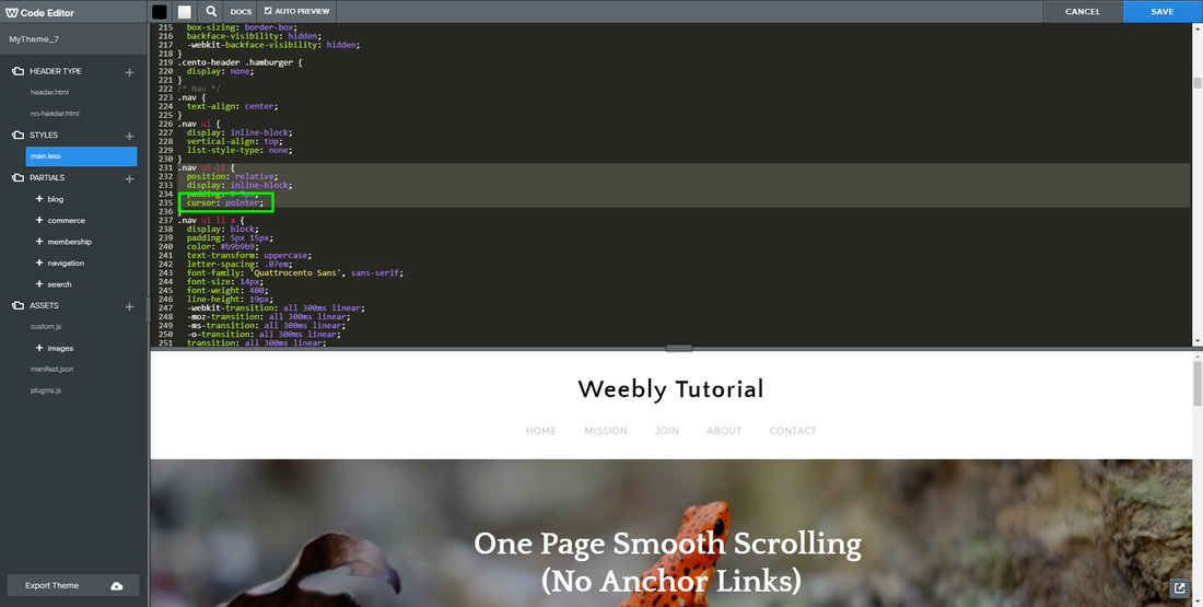
By default, when you hover a non-clickable menu in the navigation, the cursor doesn't change from an arrow to a pointer to indicate its clickable.
To fix this, go to "Theme" at the top and click on "Edit HTML/CSS" on the bottom left. On the left, under "STYLES", click on "main.less". On the right, locate your navigation's "li" code and add the following CSS code to it as shown below in orange:
.nav ul li {
position: relative;
display: inline-block;
padding: 0 5px;
cursor: pointer;
}
Need Help Installing This Tutorial?
Editor Tricks Web Design Services
Open
· Closes 5 PM
Closed
· Opens 7 AM

Recent Tutorial Comments


